
A2 Display Board

References:
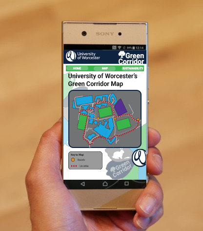
Velasco, J., 2017. Sony Xperia XA1 And XA1 Ultra Hands-On!. [online] Android Authority. Available at: <https://www.androidauthority.com/sony-xperia-xa1-ultra-review-752503/> [Accessed 7 May 2020].
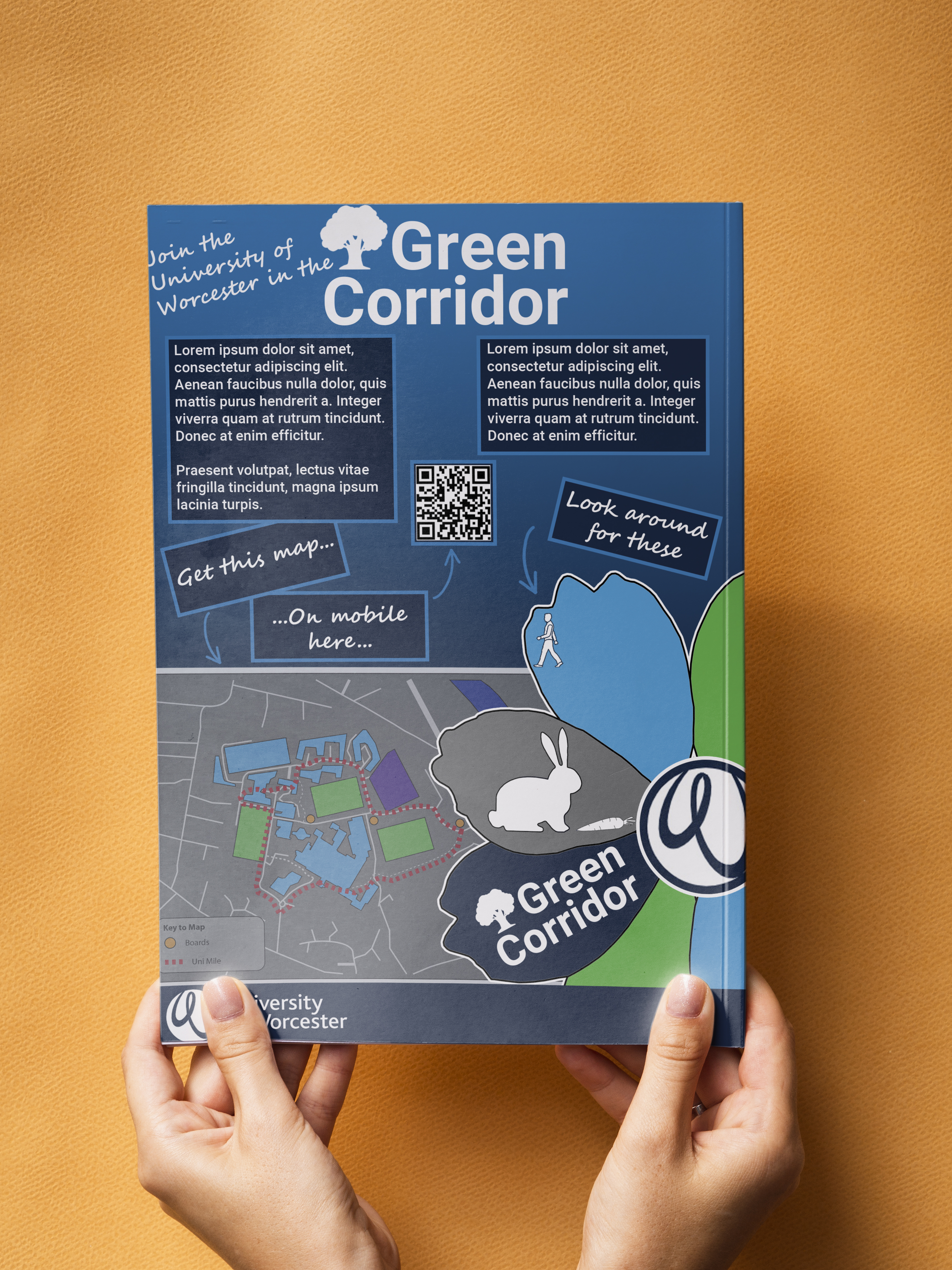
Freepik. 2020. Download Hands Holding A Nature Magazine On A Orange Background For Free. [online] Available at: <https://www.freepik.com/free-psd/hands-holding-nature-magazine-orange-background_5674505.htm#page=1&query=mockup%20paper&position=22> [Accessed 7 May 2020].
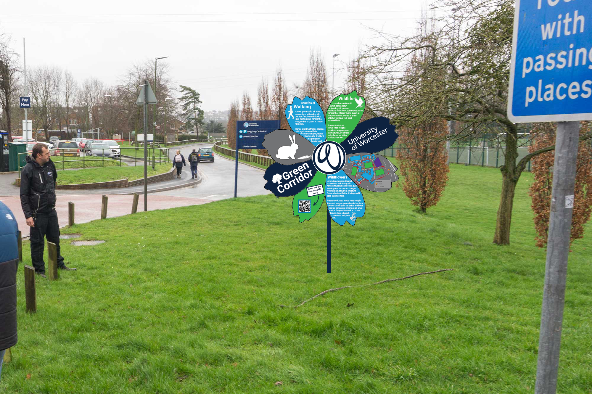
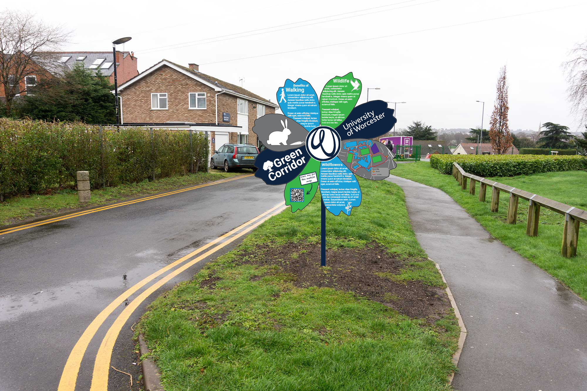
The next job on the agenda was to start the creation on the supporting media for the Flower board design. Like I mentioned in the post about the World design, I would like the A4 leaflet and the mobile webpage to tie in directly with the design, making it very easy for people to connect them together. With that in mind, I wanted the flower to feature on both media forms.
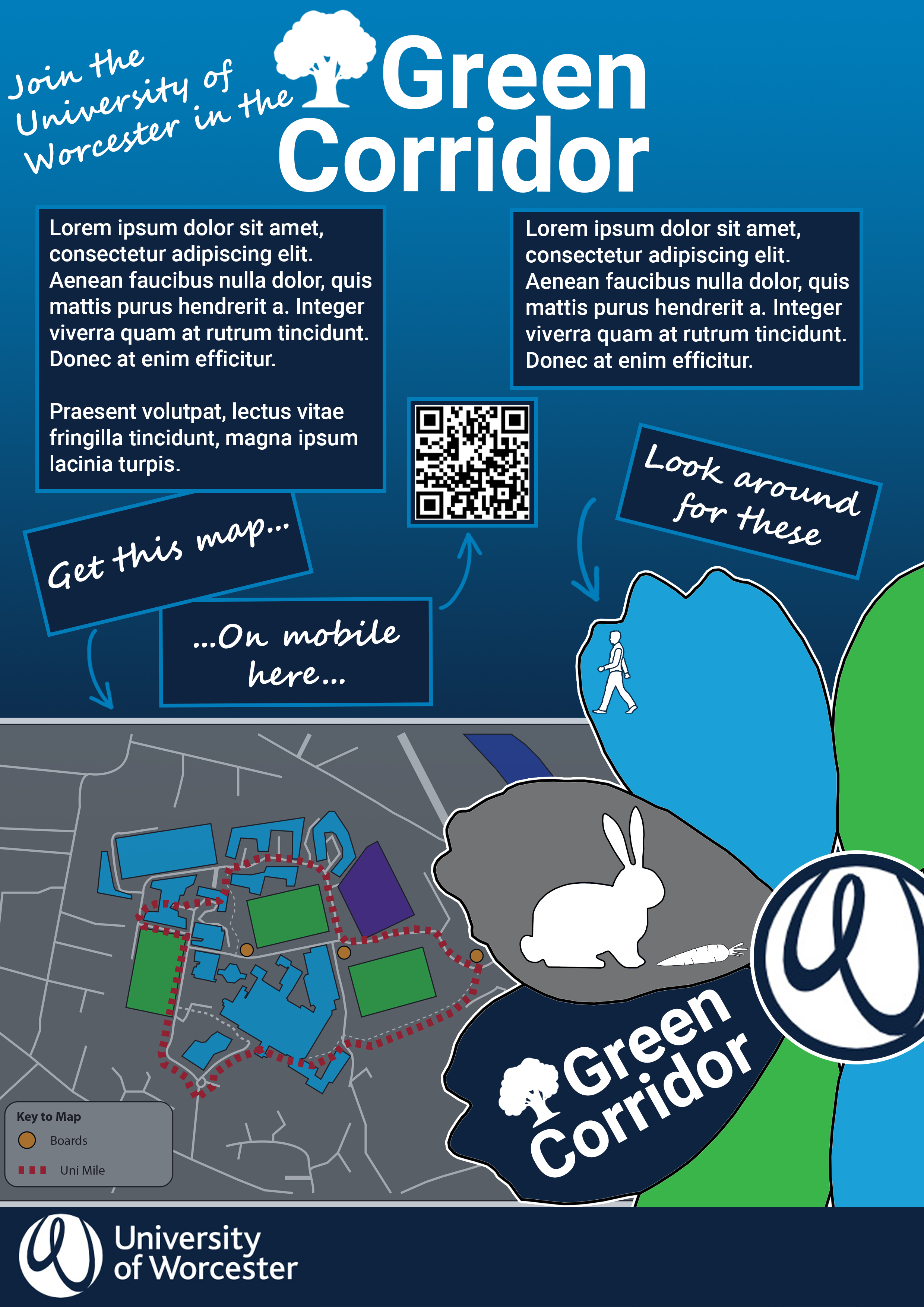
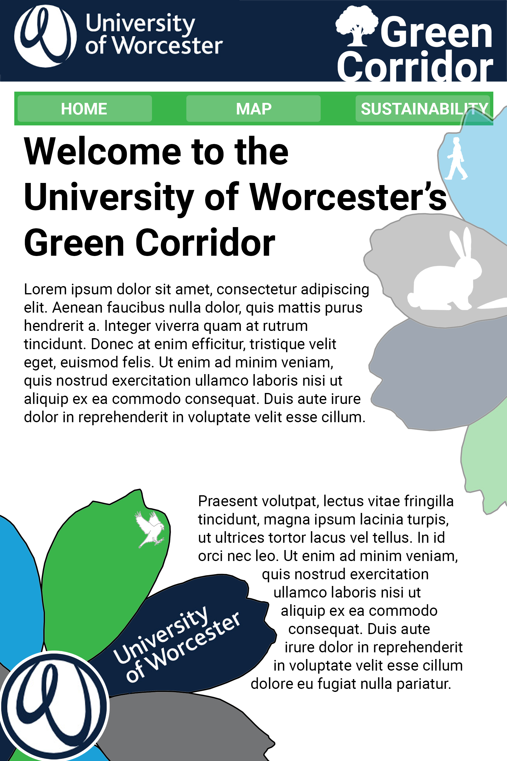
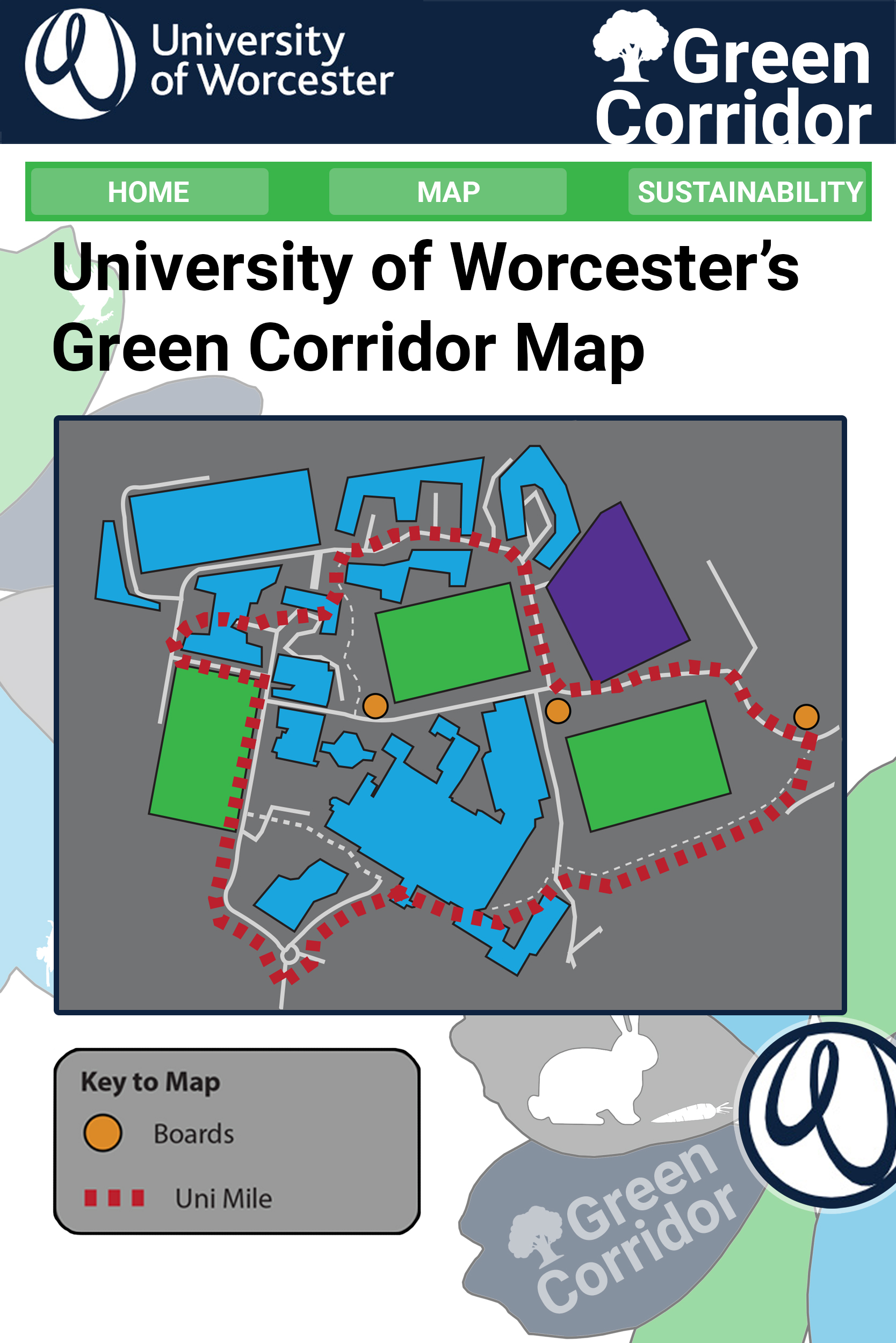
I am really happy with how these designs have come out and how they link with each other whilst also being different. The next step for these designs is to apply them to mockup photos, to see what they would look like on a piece of paper or on a mobile screen, respectively.

From my initial drawings, I have now re-created all 3 designs in a digital format and I think I prefer the Flower over the World and the Rectangle. This is because the shape is different to every other board that I have seen. The centre of the flower also really lends itself well to where the University of Worcester logo would go (both being circles). Having the same Worcester blue behind the “University of Worcester” was mandatory so to subtly tell the audience the name of the ‘trail’, I decided to have the same blue behind “Green Corridor”.
Originally, I was going to change the colour of the map but it worked with the other colours so I chose to use the same colour on the petal opposite. This is what birthed the opposite petal being the same colour idea.
I will now be taking this design forward, iterating on the board design, if I think that it needs to be changed.

What I like about this design is that each “landmass” is a different piece of information that the user would need. Due to the amount of content that I would need for each section, I was unable to use the real landmasses of Earth but I do think that it is distinguishable for a globe. I chose this shape as it connotes well with nature and not ‘man-made’, it is also not a typical rectangle shape for an information board. To begin with, I attempted to weave the corporate ID into the globe itself but that didn’t work well as it took up too much space within the landmasses. I decided to box off the bottom of the world and that gave me enough space to put the Uni logo and the name of the project.

I wanted the A4 leaflet to directly tie into the board design so that if someone picked up one from reception, they wouldn’t have any doubt that the boards were related. For this reason, I decided to put the globe without any info or pictures on (so as to not spoil the experience) with a fun, comic way of suggesting to the viewer to look out for them.
Below are some initial drawn concepts that I would like to try and recreate digitally, experimenting with colours, composition, etc. Out of the three, I believe that the world-shaped one is the one with the most potential of being interesting and eye-catching.
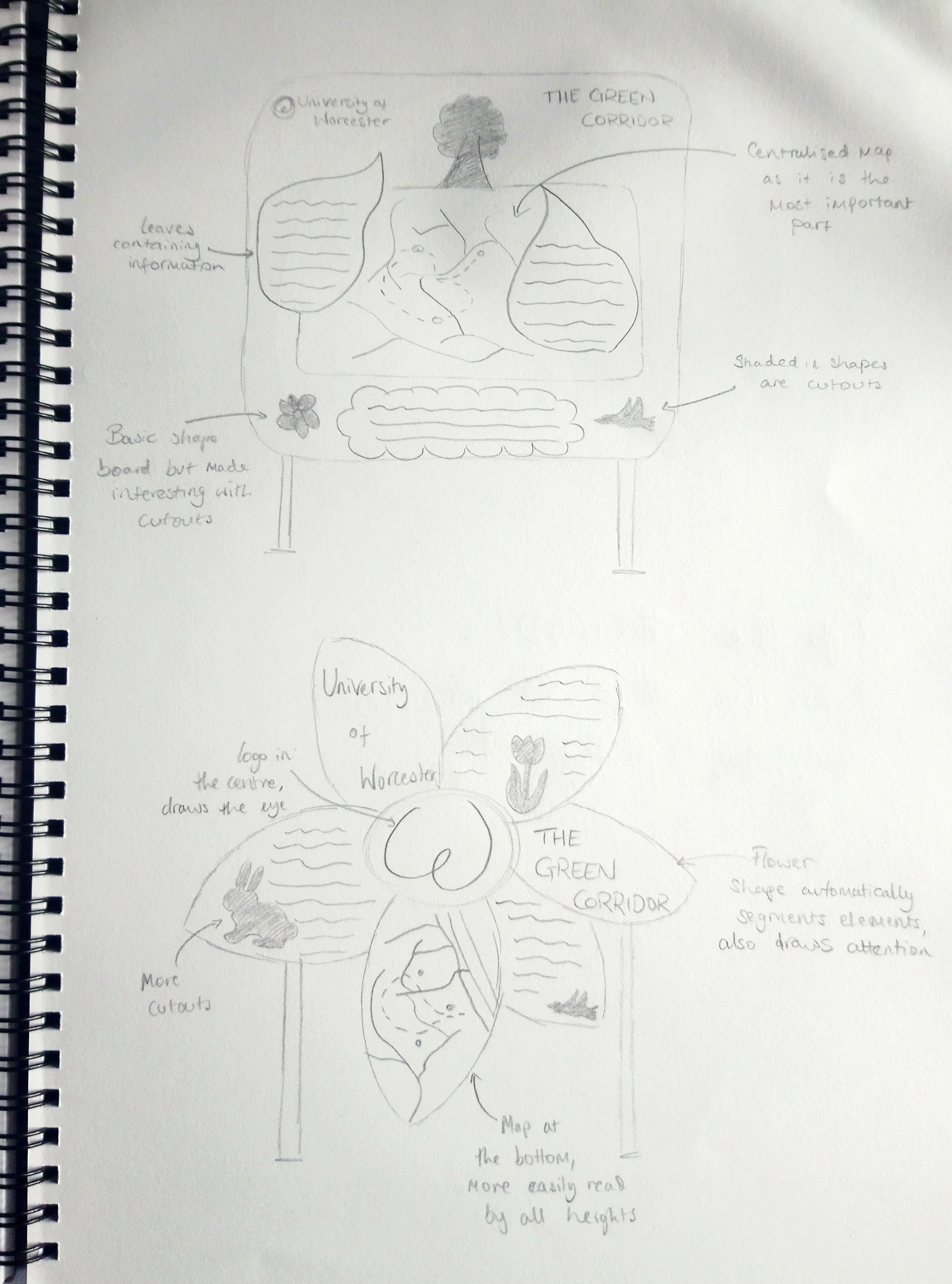

Next, I decided to recreate the rounded-rectangle board and get some feedback from some of my peers which I could use going forward, even if I decided to pick one of the other design routes

Received feedback on this early design and the main points were:
– Clean up the drawn elements like the leaves and the cloud
– Shrink the strokes on the leaves and cloud
– Add the map of the area
– Move the Corporate ID to the bottom of the board
– Tone down the colours, too bright
Below are some sketches of some information boards that I could take further in my design. I mainly wanted to make them stand out and, I believe to do that, I need to use a different shape other than the standard square/rectangle.
Out of the concepts that I have designed, I prefer the Flower Petal and the Tree shapes as they are the most unusual and would catch the eyes of passers by. However, I believe that these boards would be the hardest to actually create and use.
The leaf shape is also unusual but the tip of it might be difficult to read by shorter readers. Plus, it can look like a water droplet but if and when I draw it again, I will try and make it look more leaf-like and colouring it green should solve the possible mix-up.
The square/rectangle board was still a little basic, despite rounding the corners, so I decided to take inspiration from some of my research and cut out some shapes in the plastic/wood. This should, hopefully, give the illusion that the board is more unusual and eye-catching than it actually is.

Following on from that, I decided to do a few “Google Images” searches for ‘sustainability’. The results that kept coming up or the ones that I felt were linked to this brief, I drew out:

A few of these shapes would not be relevant to this brief, such as the lightbulb, house, plug and windmill. The recycling symbol could be used but this brief is mainly about wildlife and plants, not about properly disposing of rubbish.
The outstretched palm, the planet, the tree and the leaf can all be used for this brief as this is all about how the University is looking after, and providing a home for, animals and flowers.
Below are a series of images that I found online to help influence the designs that I would like to create.

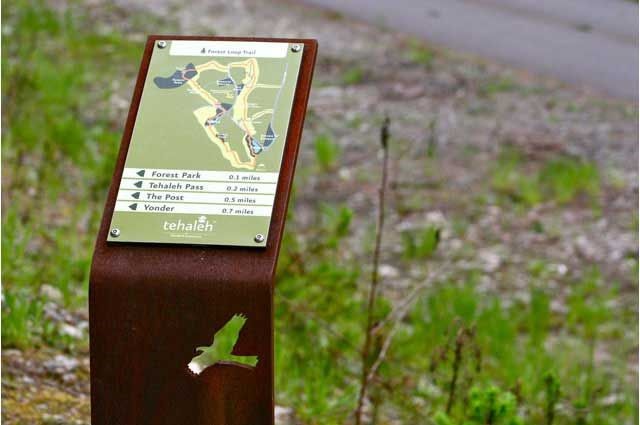
Some of the pictures above give examples of different shapes for the Information Boards. The info board in the top left has a bench attached which is an interesting idea but not practical with this brief. However, the wayfinding board with a bird cutout is definitely an avenue that I would like to pursue as I could use a ‘simple’ shape but make it look more interesting with cutouts of birds, flowers or rabbits (pictured), for example.
Another decision that I need to make was picking out potential colour schemes before starting to create. The colours that I select will have to work with the University blue corporate ID. This way, the Worcester Blue won’t look or feel disconnected from the overall style of the board:

For the above colour schemes, I wanted to have the main stems be a light green and the darker, University blue. My favourite ones that I will try in the design stages are the 1st and 4th.
Infographics about nature and the surrounding areas tend to be more illustrative based. This allows them to stand out among other greens and browns from nature whilst not being a completely different colour.
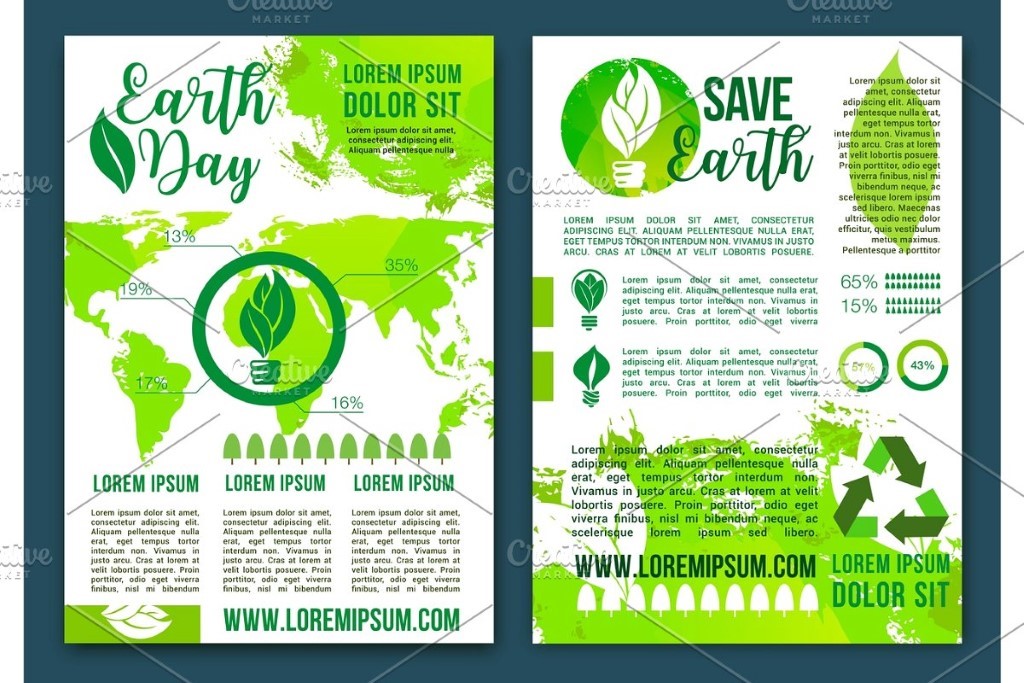
The majority of the wayfinding signs in nature are uninteresting in their shape but interesting in their content. With my designs I would like to make both interesting, like the 3rd picture above. They also typically use a graphic design style, rather than illustrative.

Have a WordPress.com account? Log in now.


